Data Visualisation – Improving Communication Techniques
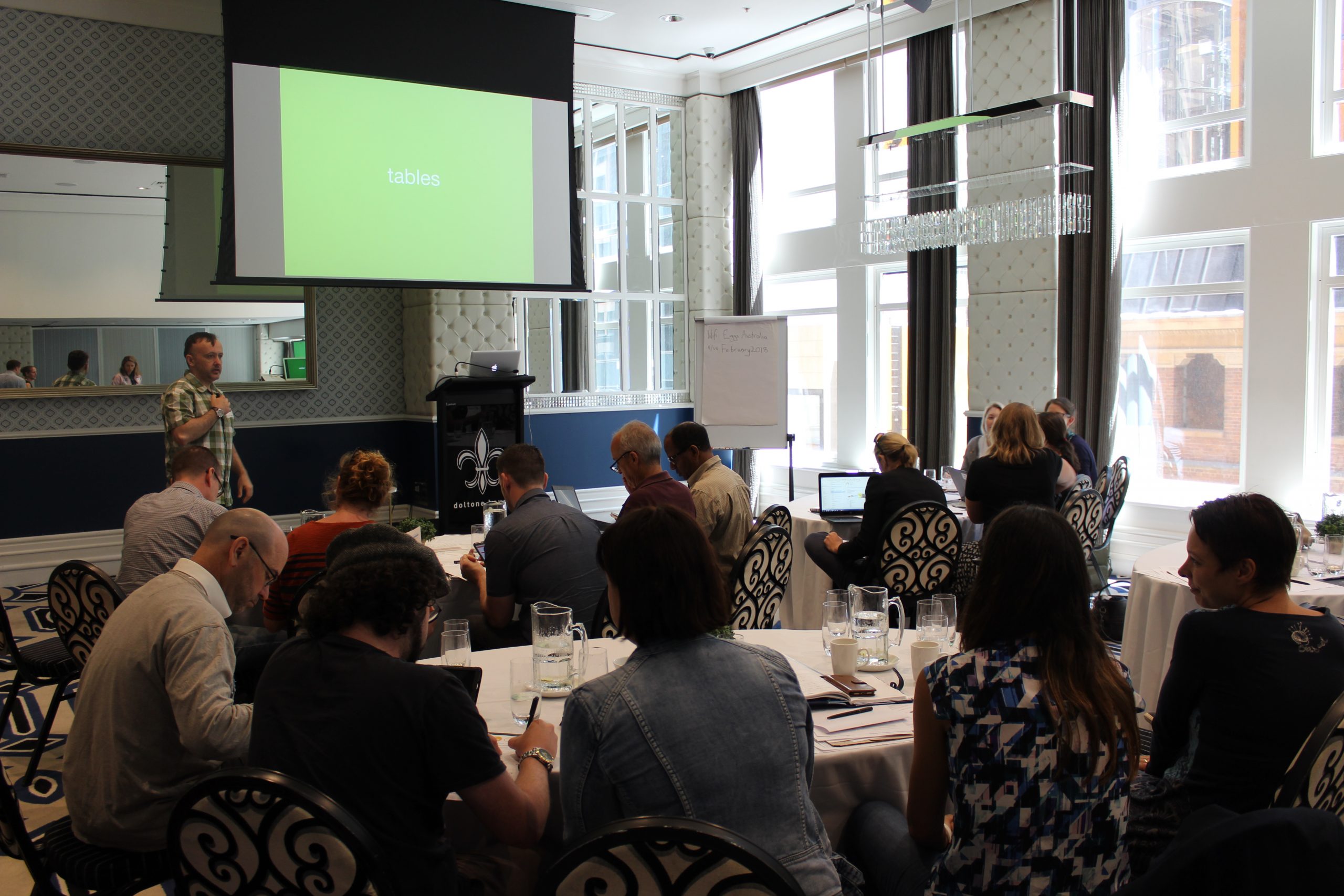
Poultry Hub Australia, Australian Eggs and AgriFutures Australia – Chicken Meat Program, are developing ways to improve the communication between researchers and industry. Extension of research outputs is acknowledged as an inherently difficult aspect of the R,D&E spectrum and one way to help improve extension and adoption is by improving the communication between industry end-users and researchers, who often use and understand different ‘languages’. These three organisations organised a data visualisation workshop in February following APSS.
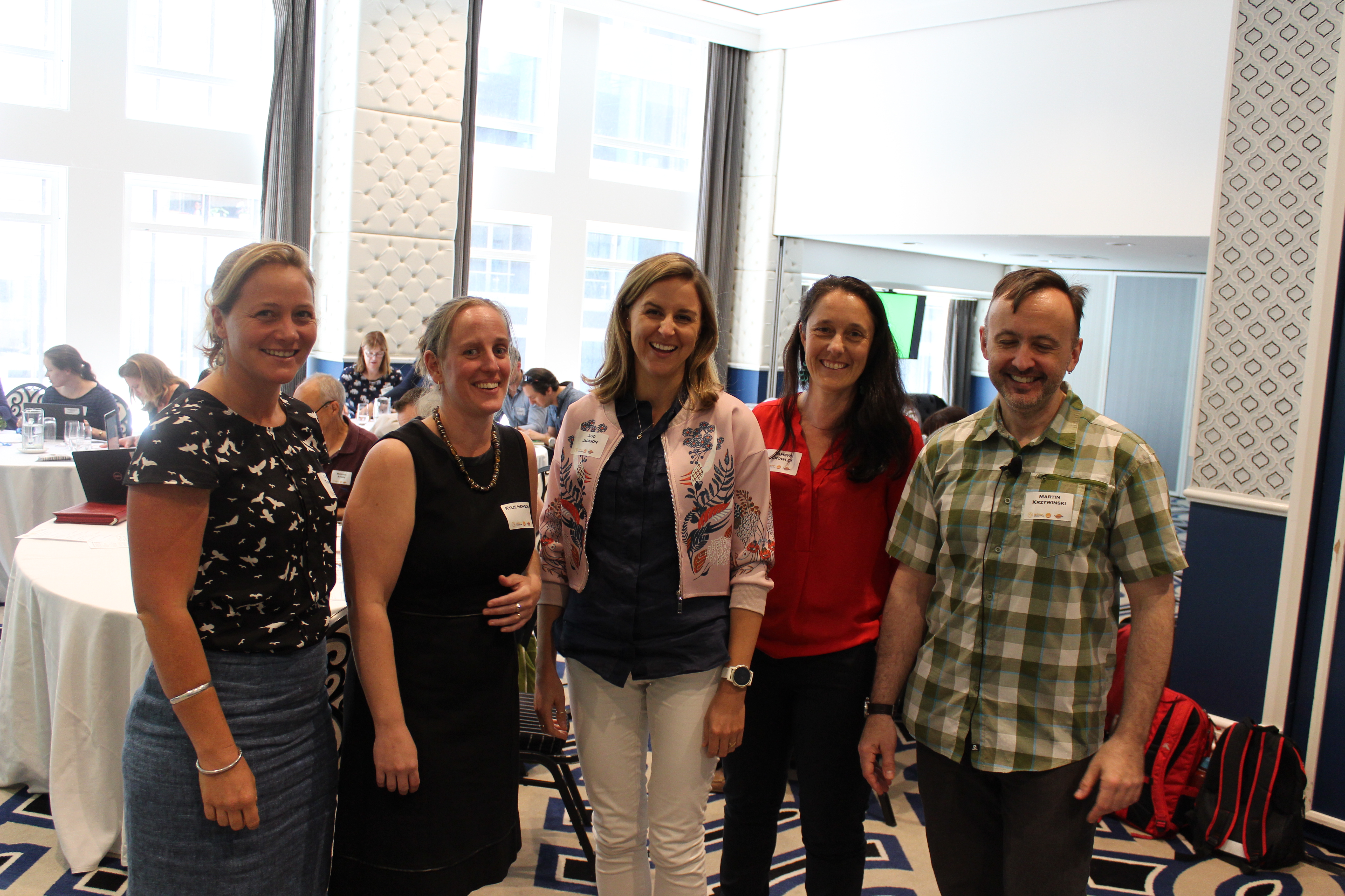
Participants were invited to submit an example of how they typically presented data in their previous research (table, figure, publication, PowerPoint etc) for consideration as a practical example to be used in the workshop. The workshop facilitator Dr Martin Krzywinski worked through the submitted examples and demonstrated how to improve them to ensure the message was clear. The level of engagement during the workshop was high and is demonstrated in the feedback for the workshop.
Sonia Liu from Sydney University stated “I would like to use the techniques I learn to develop publications in high impact cross-disciplinary research journals. They all require high quality data visualisation graphs.”
Reza Barekatain from SARDI commented “I found the Data Visualisation Workshop, one of the better and illuminating workshops I have attended. To me it was an “out of the box thinking” of how to present data. Undoubtedly, it will require me some time investment to acquire new skills of working with data and software, online tools recommended by Martin. At SARDI, we will try to practice among ourselves by sharing PowerPoints and poster presentations with this different view in mind.”
Amy Moss a PhD student from the University of Sydney explained “At the data visualisation workshop, I learnt to put more thought into which type of visual display will clearly display my data to convey the most meaning. In particular, pie charts were generally discouraged as it is much harder to compare the size of angles in pie charts than the length of bars in bar graphs. I also learnt that I should always look for ways to simplify and de-clutter the figure. For example, not repeating the same words within a legend and avoiding shadowing and 3D effects in figures. I think these lessons are particularly important for presentations where we only have a very short time for the audience to understand and take in information. So, I will be applying what I learnt at the workshop to my future presentations and figures by editing them in Adobe Illustrator to keep them simple and meaningful.”

Given the success of the workshop all three organisations are keen to run the workshop again in the future.